Thursday 18 February 2016

Looking back at your preliminary task, what do you feel you have learnt in the progression from it to the final product?

Looking back at your preliminary task, what do you feel you have learnt in the progression from it to the final product?
When looking back over my preliminary task, I am able to see some big advances in the way I have both structured and design my magazines from colour to content. Starting with my front cover page, from making my first front cover to my last I feel that I have learnt a lot about imagery. My images in my preliminary task are very basic and boring, they have not been edited and have been taken at a simple and standard angle. The font of the magazine is quite bold and blocked and the overall colour scheme for the magazine is large, there are lost of different colours shown on my preliminary task and this makes it difficult for the reader to focus on one particular thing. However, when looking at my final product we can clearly see that I have progress and learned new skills that I was able to apply to my music magazine. There is a big difference between my preliminary task and my final product, the style of the imagery is very different. The images that I took for my final product were taken in a very professional way as I used an over the shoulder shot in order to capture the attention of the audience. I really liked the overall outcome of my magazine and the professional look of it. I think something key that I have learnt in the progression of my magazine would be about how to create a magazine cover professionally and with the appropriate conventions featured. When making my final product I thought a lot about the conventions that would be used in a music magazine and tried hard to follow and use these conventions, I like this meant that my magazine was able to look professional and look as though it should be on the shelf's.  I feel that overall my skills in editing have progressed massively since my preliminary task as I did not use and editing techniques for the photos that I took for my school magazine, however when I was adding images to my magazine I used simple air-brushing and Photoshop techniques which allowed me to enhance the model and change her appearance if needed. I also used a range of filters on the images I took which I had not done before and this meant that my images were given a whole new look that would fit into my magazine.
Looking at my contents page for my final product and I can see that progress has been made with the overall content and style from my preliminary task. There is a big difference in the type of fonts and texts used in the final product and I think that this had a big impact on the overall outcome of the page. The contents for my preliminary task was very empty and basic with minimal text, this is massively different form my final product which is filled with text but organised text with columns and bullet points. I learnt that to make my contents page more appealing I had to include a range of colours that would compliment each other such as red and green, which i have used in my final task contents page. In my preliminary task I had a very small target audience being school children, this I think was more difficult than making my final magazine attract a bigger selected audience. For my preliminary piece i found it difficult to accommodate my magazine to such a small target audience due to the fact I could not alternate and be as free with my design, content and layout.
We did not make a double page spread for our preliminary task so having to create a double page spread for the first time taught my how to present large amounts of text in a way that was user friendly but also appealing to the audience and conventional at the same time. For the images that I used on my double page spread I used some quick editing and airbrushing to fix and blemishes and the makeup of the models and used the same filter over the top of both images.  I think a key skill I learnt when making my double page spread was how to make a good layout of the page and why this is important to the overall look of the magazine. Having the text laid out in columns  meant that the text was easy to view and the text was moveable and I was able to play more with the layout of the page.
Overall I think that I have learnt a lot about what and how to make a good magazine. My preliminary task was quite basic and cluttered, that meant that when first looking at it the audience were able to tell that I wasn't very experienced in making a magazine that was conventional and appealing to them. However when looking at my final product we can see that I have learnt from the mistakes I made on my preliminary tasks and took new skills that I have learnt and applied them in our to make a professional and conventional rock music magazine.
 

Wednesday 17 February 2016

What have you learnt about technologies from the process of constructing this product?

What have you learnt about technologies from the process of constructing this product?
When I began to make and plan my magazine I learnt that technology was very important to the process and success of a magazine of any kind. I learnt a great deal about what technologies were appropriate to use in the process of making a music magazine and what technologies were not appropriate to use.
For my music magazine the first step for me was to take photos that I would use in my magazine and to do this I used a Canon 60D digital camera, this enabled me to take high resolution pictures at a professional level which would look appropriate on my magazine. It was important that my images for my magazine looked professional as this would help to bring in the target audience that I wanted. I found when using this camera that I was able to learn quickly how to take the best shots with the equipment that I had access to. I learned quickly when using the canon camera how to focus the lens on what I wanted and how to use it's features to my advantage. In the process of taking my photos I used spotlight which enabled me to take photos with professional lighting which were able to capture the overall look of the 'model'. This was important as it meant that my photos were able to be given professional lighting which would help the images to keep with the professional look and this would keep me further on in the editing process.
This is an example of a photo that was used in my magazine, this was the unedited version that was taken directly from the camera. As you can see the spotlights made a massive difference when taking the photos and had a create effect on them by enhancing the models and creating shadows which added to the overall effect on the image. After taking my photo's I needed to edit the in order to make them look the way I wanted them to in my magazine. In order to do this I used a website called Picmonkey. On Picmonkey I was able to perform simple airbrushing and Photoshop techniques which enabled me to keep the professional look to my magazine . Picmonkey was a relatively easy sit to use and this meant that I was able to edit the photos to the best of my ability. Another website I used was Pixlr, I used this as for some of my photos I needed to remove the green screen background that was in the image and add a new background colour of my choice.
When I began to put my magazine together instead of using Microsoft publisher which was what I had used originally and found that the overall product was not what I had expected, so therefore I decided to use a website called Canva. Canva helped me to create and construct a very professional looking magazine by providing me with a selection of templates which I was able to get inspiration from and work form in order to create a magazine. Something I learnt about Canva was how to layer images, text and symbols over a background image. This helped me to keep continuity throughout my magazine as it meant that I was able to create a similar look for each of the pages which meant that my magazine looked real and flowed well together. I used Blogger in order to keep up to date with my work and posting in online for people to see. Using blogger meant that I was able gain feedback from my peers and teachers about my magazine and how it could be better. Having used blogger to upload my progress from last years tasks I therefore new how to use blogger and how to change the layout, style and overall look of my blog in order to keep it in the theme of my task. When I came down to blog posts I already knew how upload images, videos and Prezi's onto my blog in order to make it more interesting and allow me to present my work in different ways.

Overall I think when comparing this product to my previous product and preliminary task there is a big difference in the success of the look and the overall feel of the magazine. It is clear from the final product that I have learnt how to use technologies efficiently and correctly in order to create a professional and genre appropriate magazine that grasps the target audience that I was hoping for.

Monday 15 February 2016

What kind of media institution might distribute your media product and why?

What kind of media institution might distribute your media product and why?


I aim to aim my rock magazine at a mass audience as this will allow my magazine to get the target audience that I aimed for. I tried to appeal to the interests of teens and young adults who share a love for rock music and the genre itself.

A media institution I think might be interested in distributing my music magazine is Bauer. Bauer is a widely known publishing company and is used to working with popular music magazine such a Kerrang!. As my magazine like Kerrang! is a music magazine I feel that they would be interested in publishing my magazine as it is a conventional magazine in that it has conventional aspects to it's appearance and content but my magazine brings something new to the rock music magazine brand. Bauer publisher a wide range of magazines meaning that they would be able to promote and distribute my magazine to a larger audience and get me the mass audience that I aim to receive.

I have also looked at other publishing companies that perhaps have a smaller scale such as Imagine Publishing. Imagine Publishing is a UK based publishing company that mainly base their magazine om technology and knowledge/science. I think that Imagine publishing might consider distributing a music magazine as it could help to expand their target audience of their company and could bring a new form of magazine to their company. As their current magazines are manly technology and science, distributing my magazine would mean that my rock magazine would be the first music magazine that they were to publish and this could become a bug marketing opportunity for them which could big in new customers and subscribers. Anther publishing company that I looked at was Blaze Publishing. Blaze Publishing are on of the largest independently owned publishing company in the shooting sector. The reason that I think that Blaze Company might be interested in distributing my rock magazine is that they have recently began to distribute music magazines and create live music events. I think that this would be perfect for my music magazine as not only would they be able to distribute my magazine to a audience that are appropriate for my magazine, this company would be able to organise live music events such as festivals which could become a massive marketing opportunity for my magazine and could gain a new interest in my magazine.

Wednesday 10 February 2016

In what ways does your media product use, develop, or challenge forms and conventions of real media products?

In what ways does your media product use, develop, or challenge forms and conventions of real media products?


I think that the media product I created both uses and develops the conventions of music magazine. This allowed me to create a very professional and real looking music magazine that would interest and entertain my target audience. However, in order to give it a feel o it's own I decided to challenge some of these conventions such as the use of a main image of the double page spread and this has allowed me to create a magazine that fits the convention of a rock magazine. I am very happy with the result.


Monday 8 February 2016

How does your media product a particular social group?

How does your media product represent a particular social group?
What is a social group? A social group is a collection of people who share the same social relation. This could be age, gender, class etc.

When looking at my music magazine there are many ways in which my magazine represents a particular social group. The artist that is featured on the front cover of my magazine is a female and around the age of 18. This artist fits perfectly into my target audience as they are in the age bracket of teens to young adults and by being female this immediately appeals to a female audience as well as the stereotypical male audience. This artist helps to show the audience that the artists featured are going to be new and current artists that they can relate to as they are in the same age bracket. I think that the fact there is a young artist featured on the front cover helps to represent the target audience of this magazine and helps to inform the audience on whether this would be something that they are interested in.


Another way that I think my magazine represents a particular social group is through the tone that I used in the text. The content and text in my magazine is informal and I think that this would appeal to some socio-economic groups more than others and this could reflect on the audience that I receive. \I think that the informal text represents those of middle/working class more than those of an upper class as stereotypically they would prefer something perhaps more formal and that spoke about issues more formally. Another way that I think my media product represent a particular social group is through the clothes that my 'artists' are wearing. The clothes they are wearing are very fashionable and in style however show the artist as quite laid back. For example, on my double page spread one of the band members is seen wearing band merchandise of another band. This would be something that appeals and connects more with an audience from the middle/working class as they are able to relate to as this may be something that they commonly wear. Some of the camera angles may help to represent a particular socio-economic group. For example, all of my photo's were taken from the same level as the eye contact of the artist, this meant that the audience were able to relate with the artist and they were able to feel on the same level of the artist. 

Friday 5 February 2016

How did you attract/address your audience?

How did you attract/address your audience?


After establishing who my target audience were I was able to think about the ways that I could attract them. I decided to look at existing examples in order to analyse how they attracted their audience and this would therefore help me to understand how to appeal to my audience correctly and what features I need to think about including.


I think that I succeeded in attracting the attention of my intended target audience and this was by creating a magazine targeted at teens and young adults. I did this by using a colour scheme, layout, font, images and the overall content that is included in the magazine.

Tuesday 2 February 2016

Who would be the audiecen for you media product?

Who would be the audience for your media product?


When thinking about who the target audience for my magazine would be I began some research into existing music magazines and what their target audience's were. I looked at Kerrang! magazine which also fits into my genre of magazine and began to look at what their target audience was. I found that a similarity between Kerrang! and other music magazines was that the majority of these magazines were aimed at teens and young adults. This was clear when we looked at the age groups that bought Kerrang! magazine and the age group that had the highest sale rate. This was the age group 15-25. When I began to create my music magazine I needed to think about what age group my magazine was aimed at so I could create a design that would appeal to them. I decided that I would follow magazine such as Kerrang! and NME and aim my music magazine at teens and young adults as they seem to have the highest intake rate of music magazines and this meant that I was able to design a magazine that would appeal to them. Rock music is also becoming more popular with teens and young adults in the current music culture as the music is evolving and becoming more appealing to this generation of people.

After age I thought about what gender my music magazine would be aimed at. I decided that although I would not aimed towards a specific gender, stereotypically it would be the male gender that my rock music magazine would appeal to most so therefore I had to think about creating a magazine that would appeal to the male gender and about what stereotypically would appeal to them in a magazine and what features I could include and maybe alter that would make the magazine also appeal to the female gender as well. Another factor that I had to consider would be my audiences interests and what type of audience that could attract. I decided to look at existing magazine in order to analyse what they had included and what effect that it had on the audience of the magazine. I made the decision to include current bands and artists rather than older musicians as this was most likely to appeal to the target audience that I had planned and meant that the magazine would be up to date and relevant. I will be able to gain feedback from the magazine and from that will able to understand more of what my audience want from the content of this magazine and this will allow me to expand my audience further.

The last factor I decided to think about was the Socio-economic class of my audience and this I felt would not be a very important factor for me. I decided that when looking at the audience of my magazine that socio-economic class would not have a massive effect of my audience as it relies more on their interests as a person than what class they are in. After preforming some quick research around socio-economic groups and their interest in magazines I found that there was a wide range of groups that showed an interest in reading music magazines. This supported my decision to not aim at a particular socio-economic group, however things such as the tone and style of the writing can have an impact on which groups show a stronger interest.

Saturday 30 January 2016

The making of my double page spread

The making of my double page spread
Lastly I was tasked with making my double page spread, I didn't immediately sense an issue with my original double page spread as it was quite conventional and I had based it on a double page spread I had seen of Lead singer of Paramore, Hayley Williams. However, the issue I had with my original double page spread was that it didn't look part of my new magazine as the colour scheme, layout and etc was different to my cover page and contents page. For my contents and cover page I used  a website called Canva to edit and create those pages and for continuity I decided to use the same website to create my double page spread. This meant that my pages had the same professional look about them.


I began with a background colour for my double page spread as both of my pages background were dark colours such as black and dark grey in order the make this page stand out in the magazine but still manage to fit in with the overall look of the magazine as well. I decided that the appropriate colour to have as a background would be white, images and text stand out and are easy to read off this colour and this colour fits into the overall colour scheme of this magazine. MY next task was to pick a picture to add onto the double page spread, I chose an image of the group as they would be the feature of this page. I decided to make the title quite basic and a slightly larger size in order for it to stand out on the page but not over shine the images on the page which are intended to draw the main focus of the page. I decided that the text on this page would be an interview of one of the members of the band, this would be the main focus on the article and help the article to be professional and adds content to the magazine. Next I decided to add a second picture to this magazine article as this helps to build the character and image of the band featured on this page, this helps to make the magazine look and feel more professional.


I am happy with the overall look of this page and the way that it fits into my music magazine. I think that this page is very conventional in that it features a magazine article relating to the band on the page, this article is an interview which is a classic convention of music magazine and would be what the reader expects to be on a double page spread. I am happy with the way that the text of the magazine turned out and the layout that I chose for the text as it is very conventional and is easy to reader for the audience.

Monday 25 January 2016

The making of my contents page

The making of my contents page
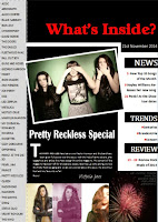
After looking at my original AS contents page submission I was quick to see some errors in the choices I made in my magazine page. I decided that this contents page was too cluttered and was hard to read and scan quickly with the amount of writing that is on the page and I think that this would put readers off the magazine. I decided that I would use the same website I used when making my cover page. This was a website called Canva. By using Canva to edit and create my magazines pages this meant that all the pages to my magazine had the same look and feel that would draw the reader in and link the magazine together. I started of in Canva by selecting a background colour for my contents page. I decided against using white however I was also against using a bright colour sure as red or blue. From this I chose to use a dark grey almost black colour for my background and this helped to give my magazine a rock look and helped to start me off designing my magazine. Next I decided to add a title for my contents however I didn't think that it was right choice to have my title as 'Contents' so from there I decided to look at existing examples of rock magazines in order to establish what the correct title to use would be. Most magazines seem to use a rhetorical question in order to create interest with the reader so I decided that I would use the same and decided to use the title ' What's inside?'. This informs the reader about what is on this page and becomes a clear guide for the to use. I chose a bold clear font for this title and chose to make it in white in order to make it stand out on the page, by making it white this draws the reader attention to the title straight away and they are clear on what will be including on this page. After adding my title I decided to include some short headers at the top of the page which included the month of the issue, as well as a website the readers can go to for further information and the word 'trends'. I decided to add the words trends in the headers as it reinforces the knowledge to the readers about what they can expect to reader about. Next I decided that my magazine needed to include some information about the magazine so this was what I decided to include next. I decided to include some article titles and a small synopsis of what will be included in these articles, this will help the readers to understand what is going to be included in this magazine. I decided to make these in black as I didn't want them to stand out as much as the title. I then realised that my magazine was lacking an image so I browsed on the clip art section that Canva had and found some small clipart images that I think worked well with the overall look of the magazine. These small images helped to draw the page back to music as they included things like the play icon and pause etc. As I was able to change the colour of these symbols I decided to make them blue as it helped them to stand out on the page and connected the colour scheme back to the cover page.

I am very happy with the way the this contents page turned out, I feel that this contents fits better into the rock category more than my original page. I aimed to make a more conventional magazine than my last attempt and I think that this magazine page is much more conventional and professional looking than the previous contents page.


Friday 22 January 2016

The making of my cover page

The Making of my cover page
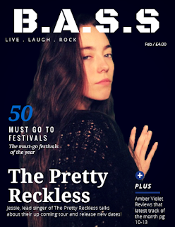
After looking back at my original cover page I quickly realised that the cover I made was not fitting to the genre and made it difficult for the audience to interpret what the genre of the magazine was and the content of this magazine. So I decided that I would try and make my magazine as conventional as possible in order to make the look genre appropriate which in this case would be a rock magazine.

After doing some quick research online into a good editing website I found a website called Canva. I found Canva a very useful to use when making my music magazine and used it to construct my cover page as well as my contents page. Canva was a easy website to use and allowed me to look at templates which influenced the layout of my magazine. When making my music magazine I began with picking my background image. This would be the main feature of my music magazine and draw the attention of the reader in. This image features one of the models selected in my original AS photos and has been edited in order for it to fit the conventions of the genre. I then began to look at a type of font that would fit the look of my magazine. I found a font called 'Blocks' and I felt that this font fitted my magazine quite well and gave it the bold look that I wanted for my rock magazine. I then proceeded to insert a small slogan for my magazine which is 'Live . Laugh . Rock'. I decided to add a slogan to my magazine after looking at Kerrang! magazine and at their slogan 'Everything that rocks'. I thought that by giving my magazine a slogan it gives the audience another thing to associate my magazine with. I then moved on to the cover lines. These are important for magazines as it gives the reader an insight in what is included in the magazine and what sort of things they can find in the magazine. These cover lines tend to include articles titles and band/artists names that will immediately grab the readers attention. I decided to change the colour of some words in order to make them stand out as I had previously seen this on a magazine. This helps to give the magazine an authentic look and a professional look that I was hoping for.

I think that the overall look of my front cover is very professional, compared to my cover page last year I have progressed far in the editing stages of making a magazine. By sticking with the conventions I was able to make small changes that help to keep my magazine the look that I was hoping for but it still fits in with the conventions of a rock magazine. I feel that by sticking to the conventions I have allowed myself to become creatively challenged in the way that I made my magazine and this meant that my magazine developed a more authentic look.

Friday 8 January 2016

Resubmition of AS Blog

After learning the grade of my AS blog I decided to resubmit in hopes to get a higher grade that would allow me to gain a higher overall grade. I decided that I would keep my music magazine the same in terms f genre and research but would change the final product of my magazine and my evaluation process of my coursework.