Saturday, 17 January 2015

Double Page Spread - Plan

Double Page Spread Plan
Double Page Spread

This is a quick digital plan i made of my double page spread. I decided a big and bold title would be appropriate for this and the artists name would be in a larger font to draw attention. I decided that i would make my double page spread an interview from a rock artist as from my research i found that interview were a common and informative way that magazines present their double page spread.


 I plan to have my image very similar to this and I plan to achieve this by using the rule of thirds. This means that the picture will become more interesting and will become the main focus of this page. This however I feel is a traditional magazine convention including the layout, having the interview in columns makes the interview in a more creative layout but still understandable. I plan to sculpt the writing closest to the image around the artist so the writing is clear and in a appropriate font. 
I decided that i would use a bold line to separate the title from the interview. I feel this adds colour to the page but does not become a distraction.

Contents Page - Plan

Contents Page Plan
Contents Page

This is a quick digital plan that i made of my contents plan. I decided that i would have the words 'What's Inside?' in a different colour and font to help it do stand out the the readers. I felt that the words 'What's Inside' give it a more usual but simple title rather than the traditional 'Contents' that it commonly placed across the top of the page. This like the cover lines on the front cover plan i made defy some magazine conventions helping to ensure it stands out. 

I deicded that i would have a large picture covering a big portion of the page to help show the taste and genre of music and also what type of rock artist that this magazine includes helping the readers to decided if they will enjoy this magazine or not and if it is to their taste in music.

I have chosen to include smaller pictures of similar rock artist to catch the attention of reader and hopefully this will help persuade them to invest in this magazine. I chose cover lines inside of what i thought readers would be looking for after researching and browsing through a number of different styles of magazine but primarily rock music magazines.

Front Cover - Plan

Cover Page

This is a quick digital plan i made out my cover page. I decided that the cover page photo would stretch over the entire page with the masthead overlapping, this will help to attract the readers attention and hopefully mean that they are influenced to buy and read the magazine.

I decided that it would look good to make the cover lines fame the outsides of the photo meaning that the audience would get a good view of the artist on the cover and would also draw attention to them. However, now that i have made the digital plan I have realized that more experimentation is needed in the position of the cover lines as i feel that having them in a 'border' around the photo is a magazine convention and i would like some of the aspects of my magazine to defy some of these conventions to help separate it from other magazines.

Wednesday, 10 December 2014

Photo-shoot - Group Shots

Group Shots
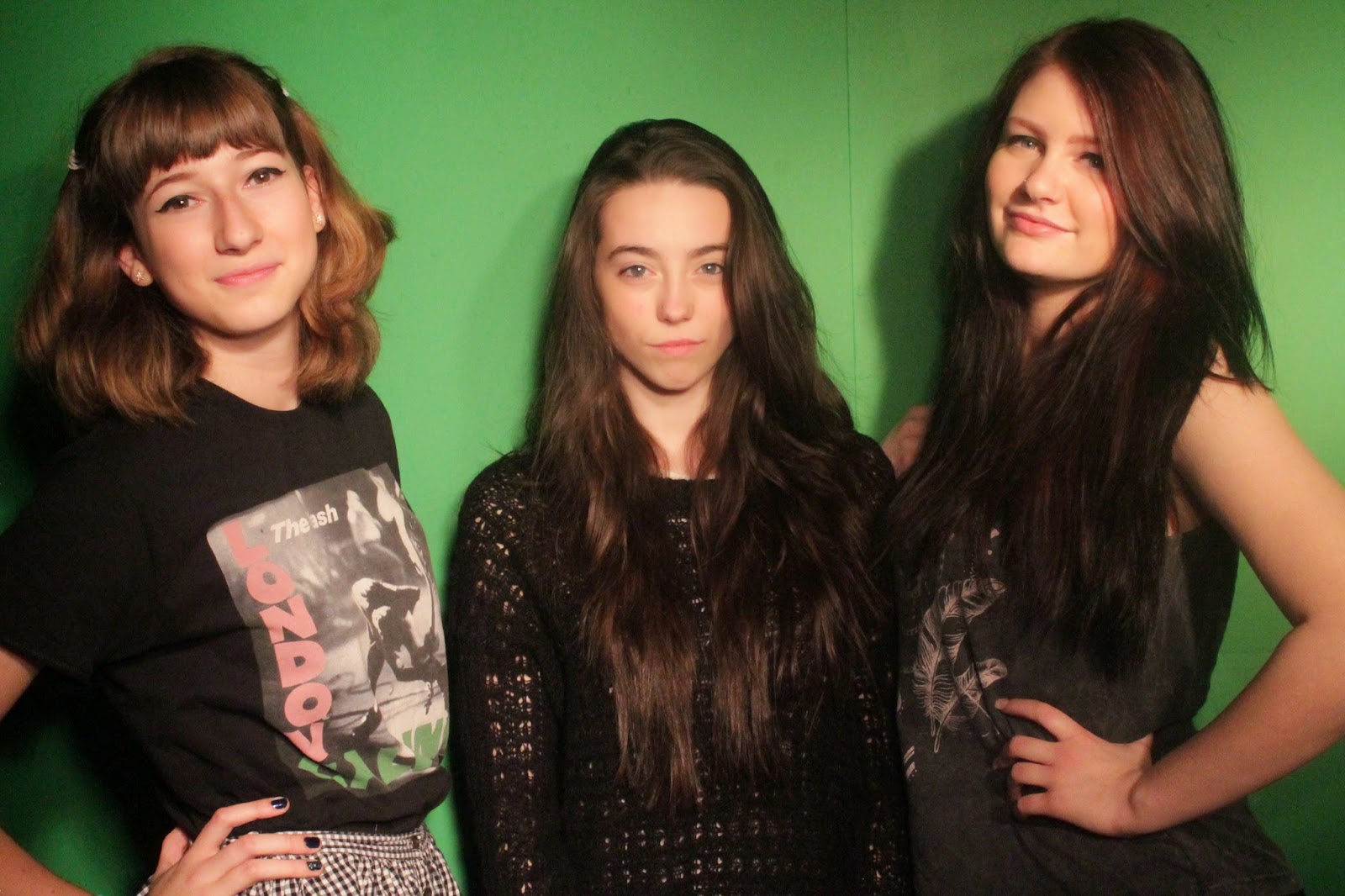
This is the first group photo I took. I asked my 'models' to dress how they would expect a rock band to be dressed. For example, in all black and/or band merchandise. Before the photo-shoot I researched rock band poses that I could get my models to recreate. I noticed that many band members liked to use the peace sign when posing in a photo-shoot. I decided that I would get one of my 'models' to do this, I also noticed that a normal rock photo convention is that a band member will swear at the camera almost like a protest.


On the second photo I decided that I will have two of my 'models' pose with the peace sign just to give me different ways of rock style posing. I decided that I would mix up the order of my models to see if it would impact the way that the photo makes me feel. I decided that my final model will be kept casual which would give off the impression that they do not care, that they are a care free person.


On this photo I decided that my 'models' would all act casual in this photo. I thought that this would be a good idea as it would make my 'models' seem less formal meaning that my magazine would be less formal. This is good as it means that I can write in a more casual way and it will help to attract the younger. I decided to keep the same order with my 'models' as I felt it was better with the taller two at the sides and the smaller 'model' in the middle. This helps to draw attention to them.


 This is the forth photo I took. I decided to change the positions of my models completely in this photo it see how it would work out. I quickly researched beforehand some classic band poses and this was one. The classic pose of one band member bending over and the others leaning on them worked well I think. I thought that this photo fits well into the magazine conventions of a band photo shoot. I decided I would rearrange the band again so i could get a range of different photo's with different orders.


This is the last group photo i took. I remembered the mantra "Hear no evil, see no evil, speak no evil. I decided this would be a good thing to play with during this photo. I decided as there are three things and i have three 'models' that it would be appropriate for them to each have a part of the mantra. I also made the decision that i would have my 'models' pose in height order.

Friday, 21 November 2014

Photography

Photography

After searching the internet and scouring the web for ideas and tips about how to take a good photo for a magazine. I have learnt that different angles specifically a low angle gives a good, professional for a magazine cover. I also need to consider the lighting when taking my photo as a dark or unusually bright photo can mean its difficult to see and difficult to edit. I have learnt that taking various shots is important as then you have a lot of shots within the same style to choose from. I will lock the focus when taking these shots as a blurred photo will be useless to me unless it is the style I want in my magazine. However, in this case it is not. 

Another tip I found on the internet a the Rule of Thirds.  Google defines the rule of third's as aligning a subject with the guide lines and their intersection points, placing the horizon on the top or bottom line, or allowing linear features in the image to flow from section to section. This image is an example of the rule of third. The lens is split into nine sections, the point of these sections is that instead on targeting the main focal point in the middle of the image you instead focus it in one of the thirds. This creates a more interesting photo to the reader that draws there interest to a different part of the image.

Wednesday, 12 November 2014

Editing

Editing


Before I took my photo's I decided to practice my skills at editing photo. I chose to do this on PicMonkey. I start off with this image of Avril Lavigne which I found on Google images.

I decided that I would adjust the brightness on this image slightly. This gave the image a more glossy magazine look.
I used an effect called HDR which enhanced some of the colour in the image. I gave Avril a Lip Tint which enhanced to colour of her lips and made them stand out more clearer. I used eyebrow shade and eye shadow to make her eyes pop out with some additional makeup effects.

The result of all of this editing was this: