Wednesday 10 December 2014

Photo-shoot - Group Shots

Group Shots
This is the first group photo I took. I asked my 'models' to dress how they would expect a rock band to be dressed. For example, in all black and/or band merchandise. Before the photo-shoot I researched rock band poses that I could get my models to recreate. I noticed that many band members liked to use the peace sign when posing in a photo-shoot. I decided that I would get one of my 'models' to do this, I also noticed that a normal rock photo convention is that a band member will swear at the camera almost like a protest.


On the second photo I decided that I will have two of my 'models' pose with the peace sign just to give me different ways of rock style posing. I decided that I would mix up the order of my models to see if it would impact the way that the photo makes me feel. I decided that my final model will be kept casual which would give off the impression that they do not care, that they are a care free person.


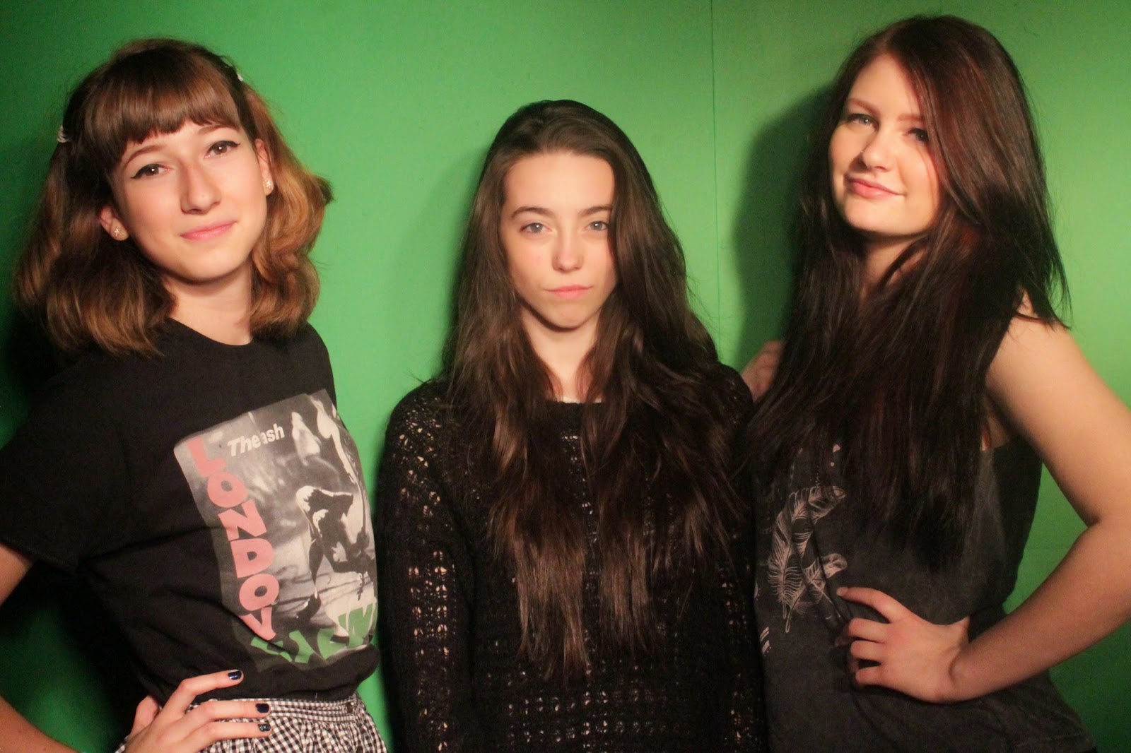
On this photo I decided that my 'models' would all act casual in this photo. I thought that this would be a good idea as it would make my 'models' seem less formal meaning that my magazine would be less formal. This is good as it means that I can write in a more casual way and it will help to attract the younger. I decided to keep the same order with my 'models' as I felt it was better with the taller two at the sides and the smaller 'model' in the middle. This helps to draw attention to them.


 This is the forth photo I took. I decided to change the positions of my models completely in this photo it see how it would work out. I quickly researched beforehand some classic band poses and this was one. The classic pose of one band member bending over and the others leaning on them worked well I think. I thought that this photo fits well into the magazine conventions of a band photo shoot. I decided I would rearrange the band again so i could get a range of different photo's with different orders.


This is the last group photo i took. I remembered the mantra "Hear no evil, see no evil, speak no evil. I decided this would be a good thing to play with during this photo. I decided as there are three things and i have three 'models' that it would be appropriate for them to each have a part of the mantra. I also made the decision that i would have my 'models' pose in height order.

Friday 21 November 2014

Photography

Photography

After searching the internet and scouring the web for ideas and tips about how to take a good photo for a magazine. I have learnt that different angles specifically a low angle gives a good, professional for a magazine cover. I also need to consider the lighting when taking my photo as a dark or unusually bright photo can mean its difficult to see and difficult to edit. I have learnt that taking various shots is important as then you have a lot of shots within the same style to choose from. I will lock the focus when taking these shots as a blurred photo will be useless to me unless it is the style I want in my magazine. However, in this case it is not. 

Another tip I found on the internet a the Rule of Thirds.  Google defines the rule of third's as aligning a subject with the guide lines and their intersection points, placing the horizon on the top or bottom line, or allowing linear features in the image to flow from section to section. This image is an example of the rule of third. The lens is split into nine sections, the point of these sections is that instead on targeting the main focal point in the middle of the image you instead focus it in one of the thirds. This creates a more interesting photo to the reader that draws there interest to a different part of the image.

Wednesday 12 November 2014

Editing

Editing


Before I took my photo's I decided to practice my skills at editing photo. I chose to do this on PicMonkey. I start off with this image of Avril Lavigne which I found on Google images.

I decided that I would adjust the brightness on this image slightly. This gave the image a more glossy magazine look.
I used an effect called HDR which enhanced some of the colour in the image. I gave Avril a Lip Tint which enhanced to colour of her lips and made them stand out more clearer. I used eyebrow shade and eye shadow to make her eyes pop out with some additional makeup effects.

The result of all of this editing was this:

Friday 17 October 2014

Target Audience

Target Audience

When I think about the average target audience music magazine's get  I would immediately think of teens or young adults. However, depending on the magazine and the genre it has become known that adults and people of an older generation are also likely to buy a music magazine.


After looking over the statistics I have extracted for the National Readership Survey I can clearly see that there is a wide differentiation between some magazines. For example, Kerrang has a readership of 15-34 year old at about 192,000 where as its readership for over 35's is only 60,000. However, Q has a higher total of readers over 35.


I have decided I will try to aim my target audience towards teens and adults, young and old. I feel this will give me a wider range of music to express throughout my magazine. I also feel that if my target audience is wide that the type of music I can out into my magazine is more interesting.

Tuesday 14 October 2014

Masthead

Masthead

When brainstorming ideas for my Masthead I decided to create a mind map to help me think of different areas of music I could involve in my masthead. In my mind map I included I range of things such as cliche's and contradictions of my genre of music.                                                       


In this brainstorm I thought about a colour scheme that would work for my masthead.  I thought about what colour would give the best impression of rock. I decided that to give an impression of rock the best colours to use would be Black, White or Red. I would decide further what colours to use when I had decided on a title and see what the results would look like.

Then I decided to think about what images come to mind when thinking about rock to help me decide what image to use as a backing image for my masthead. I thought about maybe using fire as a background but decided against it as it may give off a more violent vibe than I am looking for. Death plays quite an important part in the overall look of Rock. When I thought about including skulls or cross bones in my masthead I immediately disagreed with the thought as I felt it would draw to much attention away from the title and also make the magazine have more of an adult focus.

I also thought about what words I associate with Rock which may help me create a name for my magazine. I prefer the name B.A.S.S. that gives off the impression of Rock and music but does not apply to a specific audience which works for the magazine I am aiming to create. I thought about which other names could apply to my magazine. I also liked the name Disturbance as it gave off the impression of an abnormal type of music however I felt that the name itself was too long.
When I considered what cliches you normally associate with rock music I came with the idea of leather jackets, biker boots and long, black hair. All of these represent a cliche rock impression.

Next I decided to try out the name B.A.S.S. in different fonts, colours and with different backgrounds.  After choosing a font that I liked I decided to experiment with colours and backgrounds. As show I experimented with 4 colours - Black, White, Blue and Red. All of these colours I felt gave I rock impression. After experimenting with them I decided that I liked to feel the last example gave me about rock. So I have decided to use a black background with white text.

I decided to think of a backing image to insert to my masthead. After re looking at my brainstorm I choose an object that I thought reflected Rock. I choose a simple guitar that I felt would look good behind my writing to make my masthead more interesting. After a lot of editing and changes I have now decided on a masthead for my magazine.


This is my masthead. I decided to use black and white to give a hard core impression and flipped the S.S to have a more interesting choice of words. I also added my picture of a guitar and changed to colour so it became more faint. I am happy with the results.

Friday 10 October 2014

Types of Research

Types of Research
Qualitative Research
: Qualitative research is designed to reveal a target audience’s range of behavior and the perceptions that drive it with reference to specific topics or issues. It uses in-depth studies of small groups of people to guide and support the construction of hypotheses. The results of qualitative research are descriptive rather than predictive.

Primary Research: Primary research consists of a collection of original primary data collected by the researcher. It is often undertaken after the researcher has gained some insight into the issue by reviewing secondary research or by analyzing previously collected primary data.

Secondary Research: Secondary research (also known as desk research) involves the summary, collation and/or synthesis of existing research rather than primary research, where data is collected from, for example, research subjects or experiments.

Quantitative research: Quantitative Research is about asking people for their opinions in a structured way so that you can produce hard facts and statistics to guide you. To get reliable statistical results, it’s important to survey people in fairly large numbers and to make sure they are a representative sample of your target market.

Mood Board

Tuesday 7 October 2014

Research

Research

Questions I have thought about?

1) Note down All the magazines I know in my genre
2) What does the title of the magazines convey to the audience.
3) What does the font of the magazine convey to the audience.
4)Think of possible titles for my magazine.
Answers I have concluded from my questions

My genre I will be basing my magazine on is Rock. All the rock magazines I am familiar with are:
  • Kerrang!
  • Rolling Stones
  • Rock Sound
  • NME
  • Classic Rock
  • Mojo
  • Metal Hammer
  • Spin
The title of these magazines convey different things
Kerrang!'s title is the sound of a guitar.
Rolling Stones is named after one of the greatest bands of all time.
Rock Sound conveys the genre and feeling of rock.
Classic Rock conveys the impression of old rock, classic rock.
Mojo conveys burgeoning interest in classic rock music.
Metal Hammer conveys the impression of heavy metal and hard core rock.

The font of these magazines:

These magazines have very bold and stand out mastheads. They catch the eye of people and they are mostly used of colours black, white and red.
All the magazines titles have a theme. Kerrang have a smashed header. Rolling Stones has a swirly title and the metal from metal hammer has been almost scribbled on.

The Penumbra Effect and Readership

The Penumbra Effect  and Readership

In media the penumbra is the tiny audience that is unexpected, e.g. a elderly woman watching MTV with a child present.
Elderly Woman = Penumbra
Child Present = Main Audience

There are companies and organizations in the world which focus on finding readership results on every thing from television guides to music magazines.

One of the most well known readership organizations is NRS, which stands for National Readership Survey.
The National Readership Survey is a joint venture company in the UK between the Institute of Practitioners in Advertising (IPA), the Newspaper Publishers Association (NPA) and the Periodical Publishers Association (PPA). It provides audience research for print advertising trading in the UK. The survey covers over 250 of Britain's major newspapers and magazines, showing the size and nature of the audiences they achieve. It classifies audiences in a number of ways, one of which is the NRS social grade.
This is the statistics of music magazines form July 2013 - June 2014. These were recorded and inputted by NRS.

As you can see there is a difference in the type of magazines people enjoy. ABC1's (Higher up in the social class) enjoy some of the same things as C2DE's (Working Class).  The amount of ABC1's reading Kerrang compared to the amount of C2DE's reading it is not a dramatic change. However, the amount of ABC1's reading Radio times is drastically bugger than the amount of C2DE's reading it. This makes me believe that the content and genres of music involved is more appealing to people of a higher class.

Monday 6 October 2014

History of Magazines : Rolling Stone

History of Magazines : Rolling Stone

Rolling Stone is a bi-weekly music magazine. It focuses on music, politics and culture and likes to give an overall choice of everything to get most readers. It was first published on November 9th 1967 by Jane Wenner and Ralph J. Gleason. Its known widely for it's musical coverage. In 1990's the magazine decided to change its format to interest a younger generation of readers. It became about television shows, films and actors. However, recently its become more focused on its music content. Wenner stated in the first issue that the title of the magazine referred to the 1950 blues song, "Rollin' Stone", recorded by Muddy Waters, the rock group The Rolling Stones, and Bob Dylan's hit single "Like a Rolling Stone".

On November 5, 2012, the magazine published its first cover in the Spanish language as recognition to the influence of Latino artists in American culture.

Rolling Stones expanded with now a website and a restaurant.


Friday 3 October 2014

History of Music Magazines: Kerrang

History of Music Magazines: Kerrang


Kerrang! was first published in the UK on 6th June 1981by Bauer productions. Young from ACDC appeared on the first front cover. It was originally set to be published as monthly issue but as it became more popular, it was decided that it would then me published fortnightly and then weekly. During the 1980's and 1990's the magazine put bands such Bon Jovi, Metallica and Poison but later moved on to more grungy bands for example, Nirvana. It is mainly aimed at a niche audience who will listen to the bands and/or music that they feature in the magazine.

Throughout the magazine it features many different things such as band info, tour dates, new bands, album releases and the current charts relevant to the genre. It features many different types of bands such as Paramore, Green Day and Black Sabbath. Kerrang not only have a magazine they have now branch out with a radio station, television show and festival tour.

Wednesday 24 September 2014

RayGun - David Carson

Ray-gun Magazine - David Carson


'Ray Gun' is an alternative Rock and Roll magazine made in 1992 by David Carson. There are over 70 issues that defy the usual magazine conventions. His usual designs make to magazine well known and attracting to those who prefer alternative things.

PRO'S
  • It's Eye-Catching
  • Alternative
  • Stands Out
  • Unique
  • Reflects certain type of music
  • Push other magazines to become more creative
  • Good
CON'S
  • No Consistency
  • Too Alternative
  • Too Busy
  • Expensive
  • Trying too hard
  • Too Keen

My School Magazine

School Magazine


This is the school magazine that I created for my preliminary task. For this task I decided to use Microsoft Publisher as this was a piece of software that I was familiar with as I had previously used.
When making my school magazine I decided to begin with picking a colour scheme and I decided to take the colours used in the schools logo which are red, green and white. I thought that this would be a good idea as it helped to give things together and in contrast with each other. I decided that I would use a large photo as my cover photo as I liked the look of one that I had analysed and felt that this would be a good idea when making my magazine.

Saturday 20 September 2014

School Magazine Analysis


School Magazine Analysis

Before I begin to make my preliminary task school magazine I decided to analyse some existing magazine to identify how the conventions used and the overall effect that these conventions have on the look of the magazine. This is a previous students school magazine that I found when looking at their blog. I decided that this magazine would be a good example to do a textual analysis on as it is relevant to the task as it is a school magazine and also I will be able to reflect on a past students work and this will help me decide what does and does not work with the choices that they made.

Now the thing that you are first attracted to when looking at this magazine is the 'Masthead'. The masthead on this magazine is big and bold and stands out from the magazine. The masthead of the magazine is in a different font and colour which makes it stand out compared to the other text on the cover of the magazine. Something about this masthead which makes it very different to other magazine mastheads is the way that they have used the 'W' for Wilmo, for the word Weekly as well. This makes the masthead interesting and to help it stand out.
Another feature that you are immediately attracted to when first looking at this magazine is the cover image. The cover image used is bold and stands out as there is only one person included in the image that it is not to cramped or over crowned. However the way that the publisher has made the image stand out by making the image large and taking up most of the cover is interesting and defiantly something I will think about doing when I make my preliminary school magazine and my music magazine.
The cover lines of this magazine are quite bold and they did this by making particular words in a bolder colour such as red in order to draw the readers in. This is an effective method of making the cover lines stand out to the reader and would help to draw in an audience or even a different audience to the magazine. Cover lines are important on a magazine as they help to inform and give the reader an idea what the magazine is about and what it will be including. This will be important for the reader when deciding whether to buy the magazine or not.

However there are some things on this magazine that I would change or not include when making my own magazine. The structure of the magazine looks quite rushed and cluttered meaning that the actual magazine is complicated to read and could make the reader lose interest in the magazine if the layout is not simple, therefore this will be something that I need to consider when making my magazine. When making my magazine I think that I will try to focus on a colour scheme as this magazine includes many colours and becomes very hard to focus on a particular element as all of the features stand out on the magazine. These are all things I need to think about when making my own magazine.

Wednesday 17 September 2014

The Four F's of Magazine Design

1. FORMAT:
Design choices that span every issue and define a magazine's overall look and feel determine the format. These include the logo, cover lines, size of the magazine, department headers, and folios.

2. FORMULA:
The formula sums the magazine's approach to editorial content. Feature type and length, departments in the front and back of the book, photographic style, and illustrations all contribute to the formula.

3. FRAME:
The frame is the standard for outer page margins and gutters. Some magazines use the same margin width through the magazines; others vary the width, using tall top margins for features to set apart the well, for instance. The rule for using margins establishes consistency from issue to issue.
4. FUNCTION:
The function is, quite simply, what a magazine is trying to achieve and the message it's trying to send.

and successful in many industries. The big font displaying her name will attract any music lovers or Madonna fans especially if her image is not known or clear to the audience/reader. The cover lines are spread around the edge of the magazine obviously trying not to cover up the image of Madonna. The Format of this is interesting but also a classic example of magazine design. The picture of Madonna stands out as important as she is very well known  is very successful and will attract any readers just by her face being on the cover. The bar-code being near the center right is unusual as normally they will be featured at the bottom. The titles in the top right corner stand out in bold colours like white and red on a black background.

The Formula of  'Q' magazine. There will be a main feature on the front cover. The masthead (Q) is also always in the top left corner. This is a constant occurrence. The cover lines are always spread over the sides of the magazine so it does not cover the main feature who is this instance is Madonna. Throughout the issues of the magazine if the is a big star like Madonna or Michael Jackson they are placed in-front of the Masthead (Q) showing the audience that the creators of the magazine view them highly and are almost too famous to be put behind the it. The overall look of the magazines is that they cover a range of musical genres and shows in impressive look that will interest all readers.

The Frame of 'Q' magazine is that they have no margin. The designers cover every part of the magazine in something and the leave no part of the pages blank. There are no gap or frames that the magazine could use to stand out. This is a consistent feature of this magazine. There are no margins throughout their magazines and there is no gaps of spaces that have been left without.  

The Function of this magazine is that they are trying to promote various things such as bands and musical artists, Cd's and albums that you could by, gigs and concerts, others magazines such as 'Women in Music'. They are trying to inform people of artists that they may not of heard of or may not have experienced in their music genre.

Monday 15 September 2014

The Secrets of Magazine Cover Design

Poster-style cover, with minimal encroachment
on the celebrity image of Bruce Willis, for the launch
of Esquire in Moscow. Compare the way each face has 
been positioned on these covers.

The Secrets of Magazine Cover DesignLook and Feel: The way a cover looks is dictated by the publishing and editorial strategy that it is designed to put across. The poster-style adopted by Esquire for is launch in Russia is laid back and confident - with the contrast lighting giving a 'hard' feel to Die Hard actor Bruce Willis. Poster Designs are chosen by magazines that feel confident they are not facing great competition on the news-stand. However, even the top magazines will only use this style occasionally.

The men's monthly must use a face that is instantly recognizable, put the magazine in an international framework and appeal to well-off, aspirational readers. The photo of Bruce Willis for Esquire will have been taken by the one of the best photographers, it will be processed by the best repro houses and printed on very good paper by a very good printer - it will both look and feel glossy. Esquire in Russia on the hand will be sold in selected, upmarket outlets where it will usually be shown full-face on.


Thursday 11 September 2014

The Conventions of Music Magazines

The Conventions of magazine cover design: Key Ingredients
Masthead (Title, logotype, logo or nameplate): The name of the magazine displayed in a specific typeface. This is the visual branding of the title and its often done in specially designed typeface to be easily recognised and unique. The masthead - also called a title - is usually used on the contents page inside as well as the front cover, and as a logo for advertising and branding purposes.
Main Image: Example - In the case of this front cover there is a single image of the model Shania. The image is used in a classic way, the face is big enough to stand out on the news-stand, with the model making full eye-contact.
Cover lines: From the 1950's, greater competition on the newsstands resulted in more cover lines. Today , some magazines print special covers for subscribers' copies hat we use a few cover lines. Cosmopolitan magazine uses a lot of cover lines, which are distributed around the main image without detracting from it too much. A mistake often made with cover lines is that they run over an image that has a lot of colour changes, rendering the words difficult to read. This is a problem here with the red text  on the hair on the left and smaller yellow text against Shania's skin.
Main Cover Image: This is very large - taking up almost a quarter of the magazine cover - and comes in three layers, each with a different colour. Note the main cover line is positioned against the models' shoulder so it shows up clearly.


I will refer back to this when creating my music magazine as it will help me include all of the main factors and conventions needed in a music magazine. This post will help me to think about the effect that I need from my music magazine and how I can achieve this using these conventions.