Saturday, 30 January 2016

The making of my double page spread

The making of my double page spread
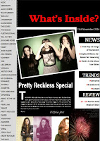
Lastly I was tasked with making my double page spread, I didn't immediately sense an issue with my original double page spread as it was quite conventional and I had based it on a double page spread I had seen of Lead singer of Paramore, Hayley Williams. However, the issue I had with my original double page spread was that it didn't look part of my new magazine as the colour scheme, layout and etc was different to my cover page and contents page. For my contents and cover page I used  a website called Canva to edit and create those pages and for continuity I decided to use the same website to create my double page spread. This meant that my pages had the same professional look about them.


I began with a background colour for my double page spread as both of my pages background were dark colours such as black and dark grey in order the make this page stand out in the magazine but still manage to fit in with the overall look of the magazine as well. I decided that the appropriate colour to have as a background would be white, images and text stand out and are easy to read off this colour and this colour fits into the overall colour scheme of this magazine. MY next task was to pick a picture to add onto the double page spread, I chose an image of the group as they would be the feature of this page. I decided to make the title quite basic and a slightly larger size in order for it to stand out on the page but not over shine the images on the page which are intended to draw the main focus of the page. I decided that the text on this page would be an interview of one of the members of the band, this would be the main focus on the article and help the article to be professional and adds content to the magazine. Next I decided to add a second picture to this magazine article as this helps to build the character and image of the band featured on this page, this helps to make the magazine look and feel more professional.


I am happy with the overall look of this page and the way that it fits into my music magazine. I think that this page is very conventional in that it features a magazine article relating to the band on the page, this article is an interview which is a classic convention of music magazine and would be what the reader expects to be on a double page spread. I am happy with the way that the text of the magazine turned out and the layout that I chose for the text as it is very conventional and is easy to reader for the audience.

Monday, 25 January 2016

The making of my contents page

The making of my contents page
After looking at my original AS contents page submission I was quick to see some errors in the choices I made in my magazine page. I decided that this contents page was too cluttered and was hard to read and scan quickly with the amount of writing that is on the page and I think that this would put readers off the magazine. I decided that I would use the same website I used when making my cover page. This was a website called Canva. By using Canva to edit and create my magazines pages this meant that all the pages to my magazine had the same look and feel that would draw the reader in and link the magazine together. I started of in Canva by selecting a background colour for my contents page. I decided against using white however I was also against using a bright colour sure as red or blue. From this I chose to use a dark grey almost black colour for my background and this helped to give my magazine a rock look and helped to start me off designing my magazine. Next I decided to add a title for my contents however I didn't think that it was right choice to have my title as 'Contents' so from there I decided to look at existing examples of rock magazines in order to establish what the correct title to use would be. Most magazines seem to use a rhetorical question in order to create interest with the reader so I decided that I would use the same and decided to use the title ' What's inside?'. This informs the reader about what is on this page and becomes a clear guide for the to use. I chose a bold clear font for this title and chose to make it in white in order to make it stand out on the page, by making it white this draws the reader attention to the title straight away and they are clear on what will be including on this page. After adding my title I decided to include some short headers at the top of the page which included the month of the issue, as well as a website the readers can go to for further information and the word 'trends'. I decided to add the words trends in the headers as it reinforces the knowledge to the readers about what they can expect to reader about. Next I decided that my magazine needed to include some information about the magazine so this was what I decided to include next. I decided to include some article titles and a small synopsis of what will be included in these articles, this will help the readers to understand what is going to be included in this magazine. I decided to make these in black as I didn't want them to stand out as much as the title. I then realised that my magazine was lacking an image so I browsed on the clip art section that Canva had and found some small clipart images that I think worked well with the overall look of the magazine. These small images helped to draw the page back to music as they included things like the play icon and pause etc. As I was able to change the colour of these symbols I decided to make them blue as it helped them to stand out on the page and connected the colour scheme back to the cover page.

I am very happy with the way the this contents page turned out, I feel that this contents fits better into the rock category more than my original page. I aimed to make a more conventional magazine than my last attempt and I think that this magazine page is much more conventional and professional looking than the previous contents page.


Friday, 22 January 2016

The making of my cover page

The Making of my cover page
After looking back at my original cover page I quickly realised that the cover I made was not fitting to the genre and made it difficult for the audience to interpret what the genre of the magazine was and the content of this magazine. So I decided that I would try and make my magazine as conventional as possible in order to make the look genre appropriate which in this case would be a rock magazine.

After doing some quick research online into a good editing website I found a website called Canva. I found Canva a very useful to use when making my music magazine and used it to construct my cover page as well as my contents page. Canva was a easy website to use and allowed me to look at templates which influenced the layout of my magazine. When making my music magazine I began with picking my background image. This would be the main feature of my music magazine and draw the attention of the reader in. This image features one of the models selected in my original AS photos and has been edited in order for it to fit the conventions of the genre. I then began to look at a type of font that would fit the look of my magazine. I found a font called 'Blocks' and I felt that this font fitted my magazine quite well and gave it the bold look that I wanted for my rock magazine. I then proceeded to insert a small slogan for my magazine which is 'Live . Laugh . Rock'. I decided to add a slogan to my magazine after looking at Kerrang! magazine and at their slogan 'Everything that rocks'. I thought that by giving my magazine a slogan it gives the audience another thing to associate my magazine with. I then moved on to the cover lines. These are important for magazines as it gives the reader an insight in what is included in the magazine and what sort of things they can find in the magazine. These cover lines tend to include articles titles and band/artists names that will immediately grab the readers attention. I decided to change the colour of some words in order to make them stand out as I had previously seen this on a magazine. This helps to give the magazine an authentic look and a professional look that I was hoping for.

I think that the overall look of my front cover is very professional, compared to my cover page last year I have progressed far in the editing stages of making a magazine. By sticking with the conventions I was able to make small changes that help to keep my magazine the look that I was hoping for but it still fits in with the conventions of a rock magazine. I feel that by sticking to the conventions I have allowed myself to become creatively challenged in the way that I made my magazine and this meant that my magazine developed a more authentic look.

Friday, 8 January 2016

Resubmition of AS Blog

After learning the grade of my AS blog I decided to resubmit in hopes to get a higher grade that would allow me to gain a higher overall grade. I decided that I would keep my music magazine the same in terms f genre and research but would change the final product of my magazine and my evaluation process of my coursework.